Noted
Noted is a publication that highlights the work of newfound authors and allows for playful exploration and expression. It celebrates the new while acknowledging the structure and discipline of literary strategy. The visual identity uses inversion of type as image and layered elements as stream-of-consciousness to articulate the art of writing. Additionally, I have created standards that dictate elements of the publication that can be applied to future editions.
summer 2019
publication design


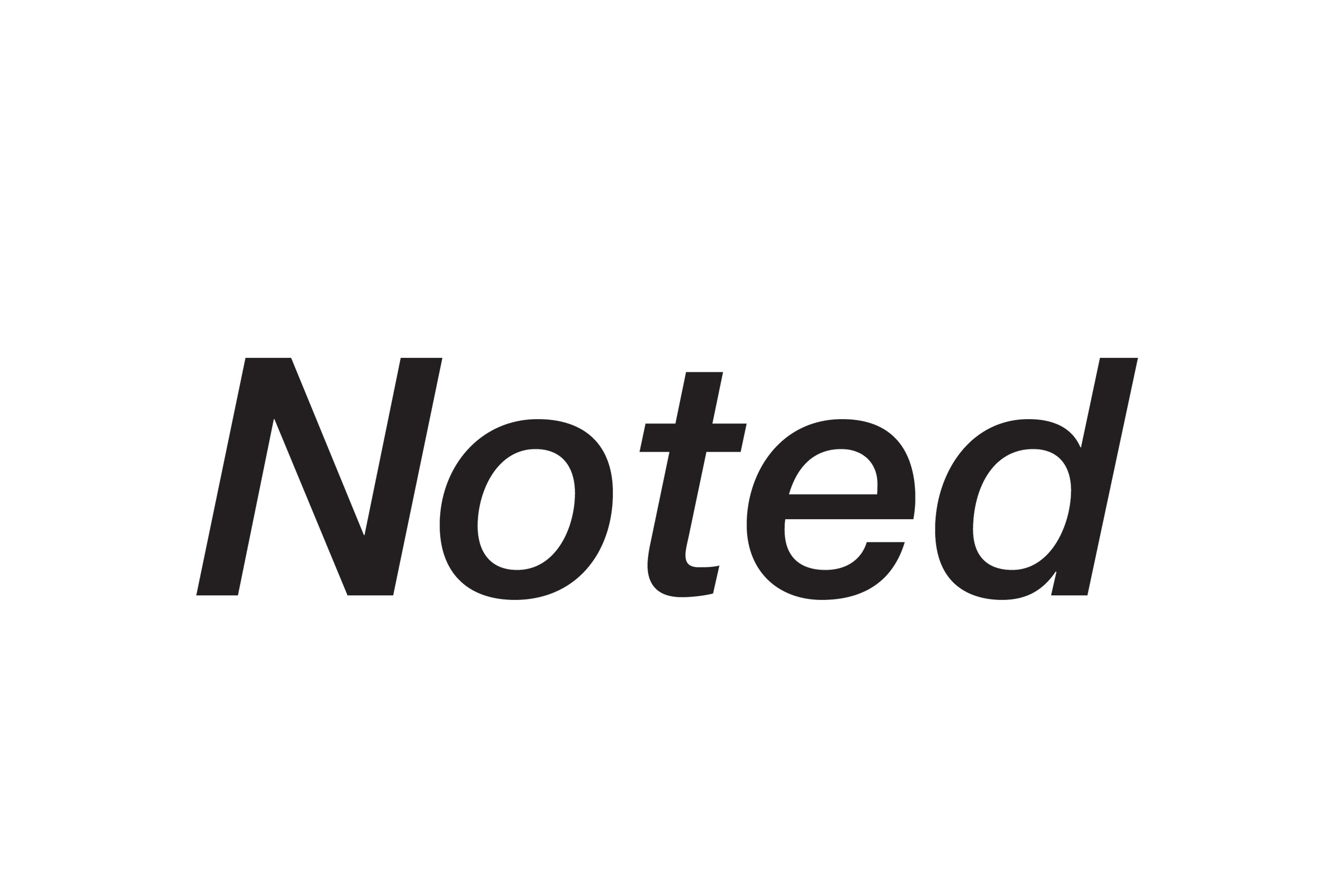
wordmark
I explored wordmarks with themes of expression, discipline, playfulness, and fusion. The final wordmark uses Helvetica Neue as a base typeface to show that Noted is taking the tried and true variables of writing but refreshing them with newfound authors. It communicates the flow and expression in writing with its posture and extended terminals, a disciplined structure with its tall x-height, and approachability with its rounded, lowercase letterforms and edges.


To carry on inspiration in the wordmark, I studied type pairings that communicate flow and soft forms. I chose the pair of Aller and Calluna because they were created with the idea and intention of flowing forms in mind. Additionally, the contrasting serifs in Calluna develop a new texture across the page and speak to traditional writing from serif fonts. Lastly, An array of possible layouts led to my final page designs, and I developed a system of standards to apply to future editions.
type + layout


